

Redesigning BBC Three’s website, improving brand awareness and aligning more closely with the needs and expectations of users
Role: MVP UX Strategy | Research | Branding & visual language | UI Design
THE CHALLENGE:
Baseline research carried out on the original BBC Three website suggested that it was not connecting with it’s 16-34 year old target audience in a positive way. There was also confusion between the BBC iPlayer and BBC3, due to unclear branding and differentiation of service. We needed to rethink the visual language as well as the site and navigation structure.
THE OUTCOME:
We created a redesigned responsive website for BBC Three that was more aligned with the needs and expectations of a young audience. This was to be rolled out iteratively, with small incremental improvements across several sprints. The Atomic Design Methodology was used and a library of UI components were created. This reusable approach would help new design improvements to be rolled out quickly and with more brand consistency across the website.
01_
Discovery
THE PROCESS:
Taking the brand guidelines developed by The London Agency, Urban Brands, we created a exploration wall, pulling out distinctive elements and measuring them against the Brand values. I also reviewed brands that our target audience engaged with to see which got their tone of voice right and how they did it.
BBC Three Brand Character should: “Be brave, smart & open” “Show, don’t tell” “Challenge your opinions” The tone should: be bold, confident, open, emotionally stimulating, thought-provoking, playful and sombre and questioning. The Visual Language is all about Contrast, Angles, Pattern, Opacity, Simple, bold and flat colours.
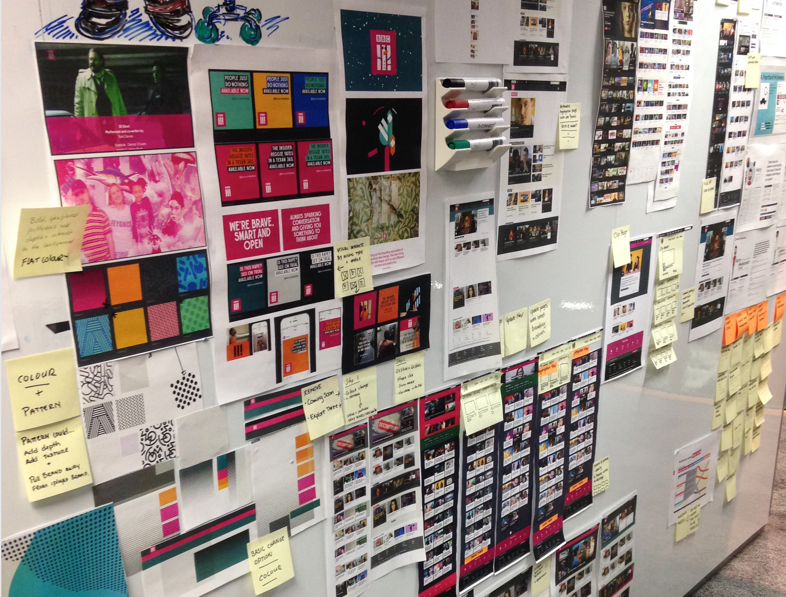

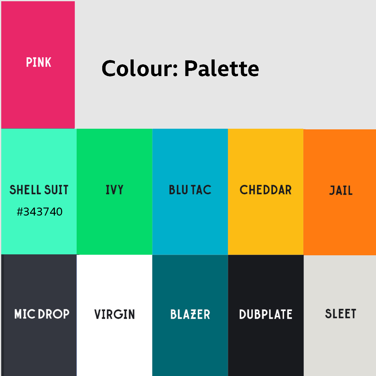
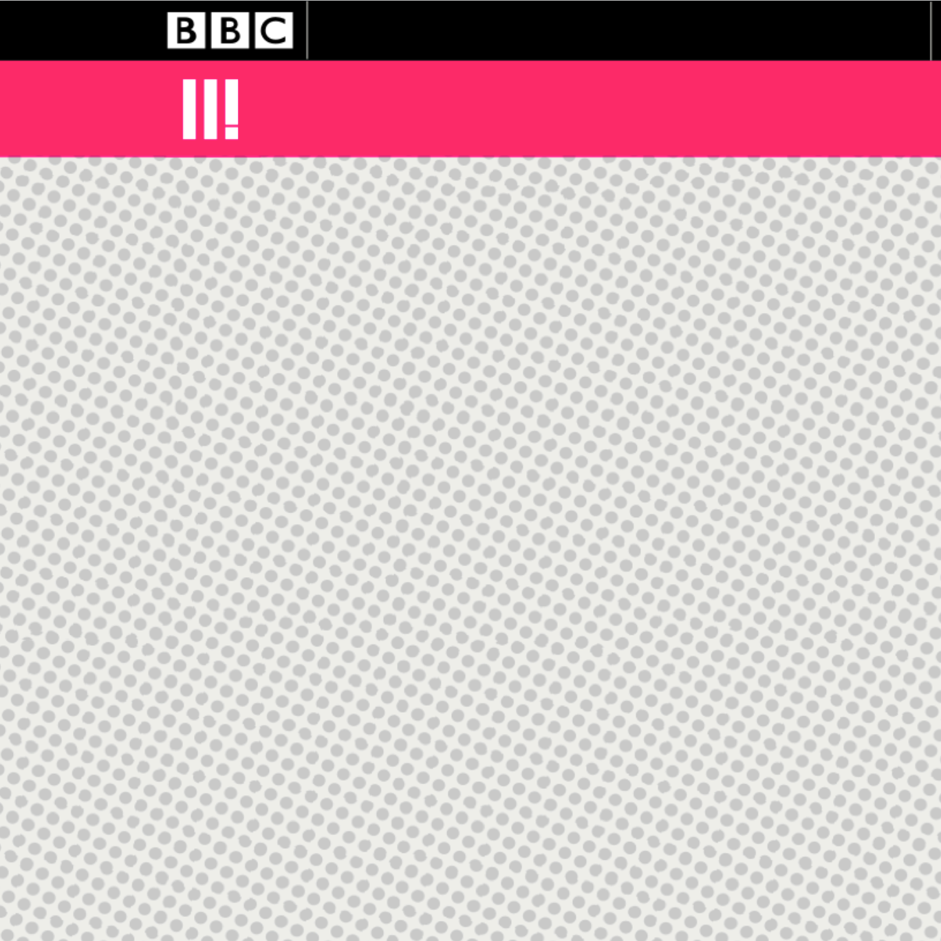
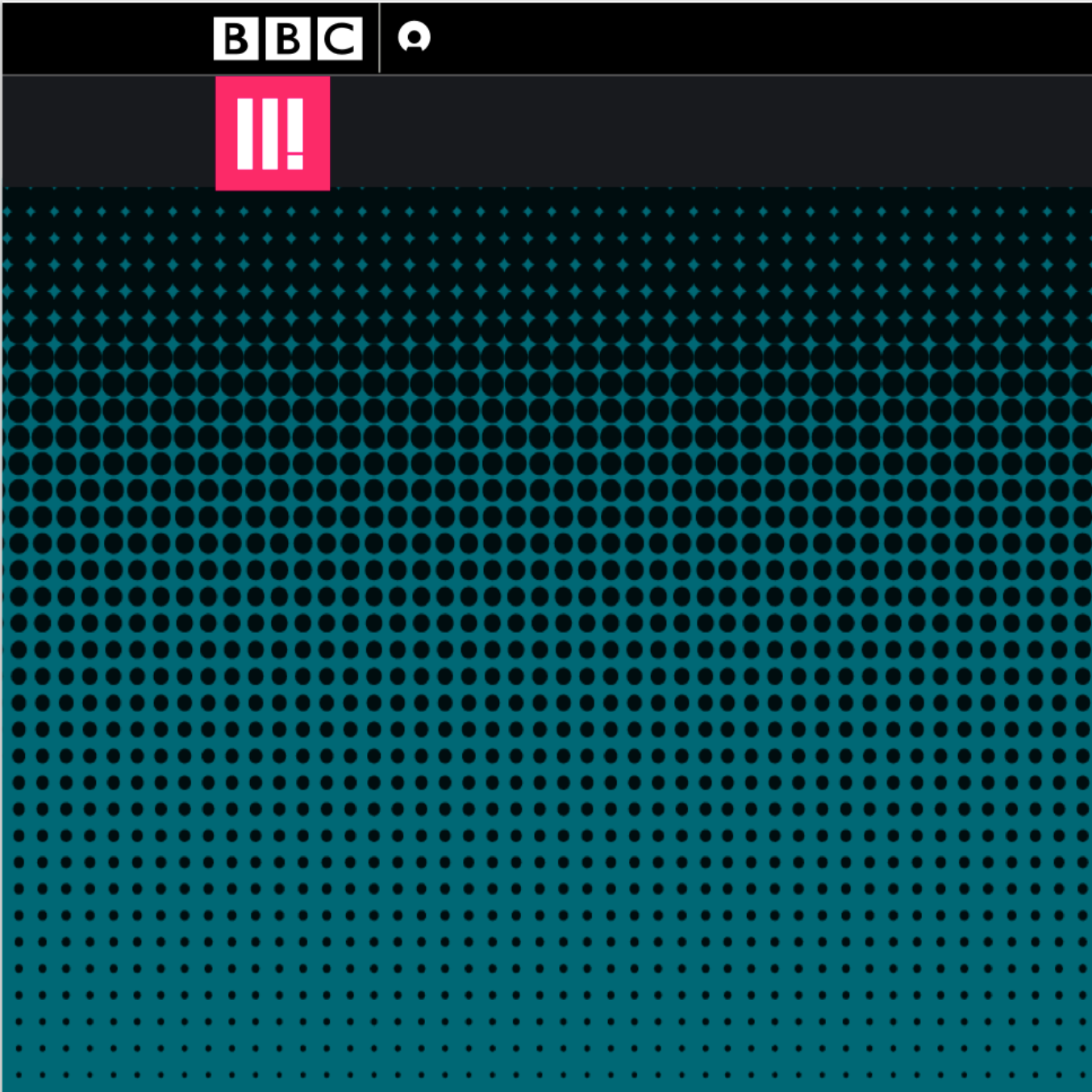
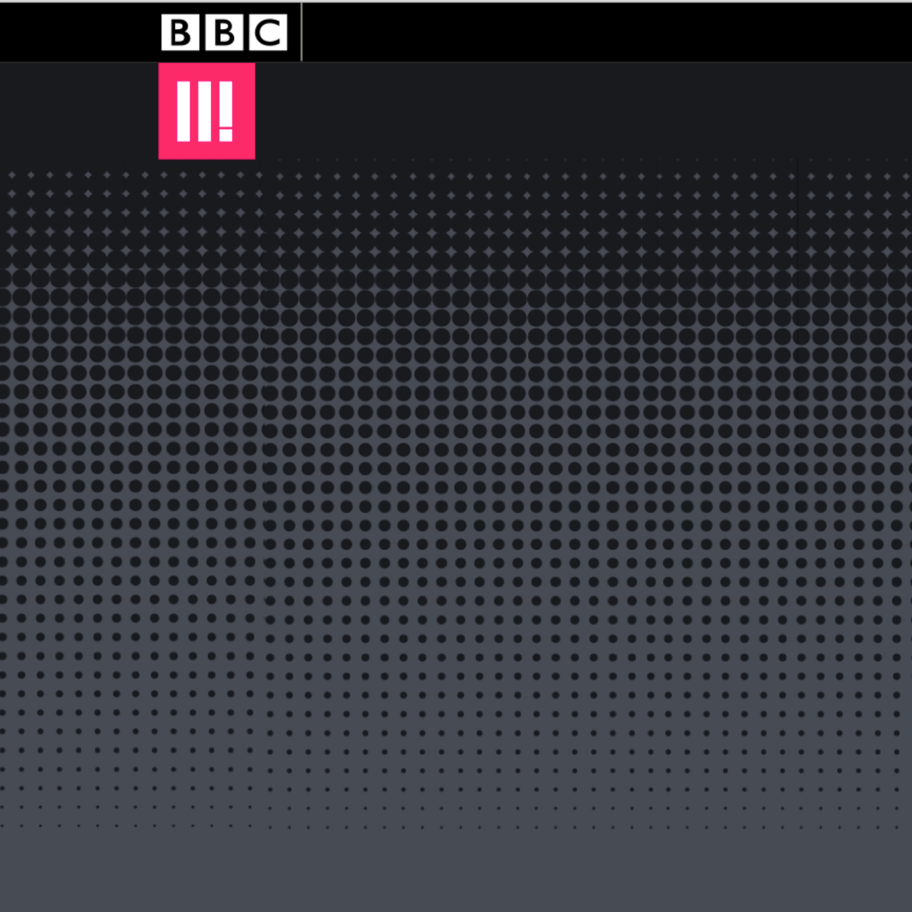
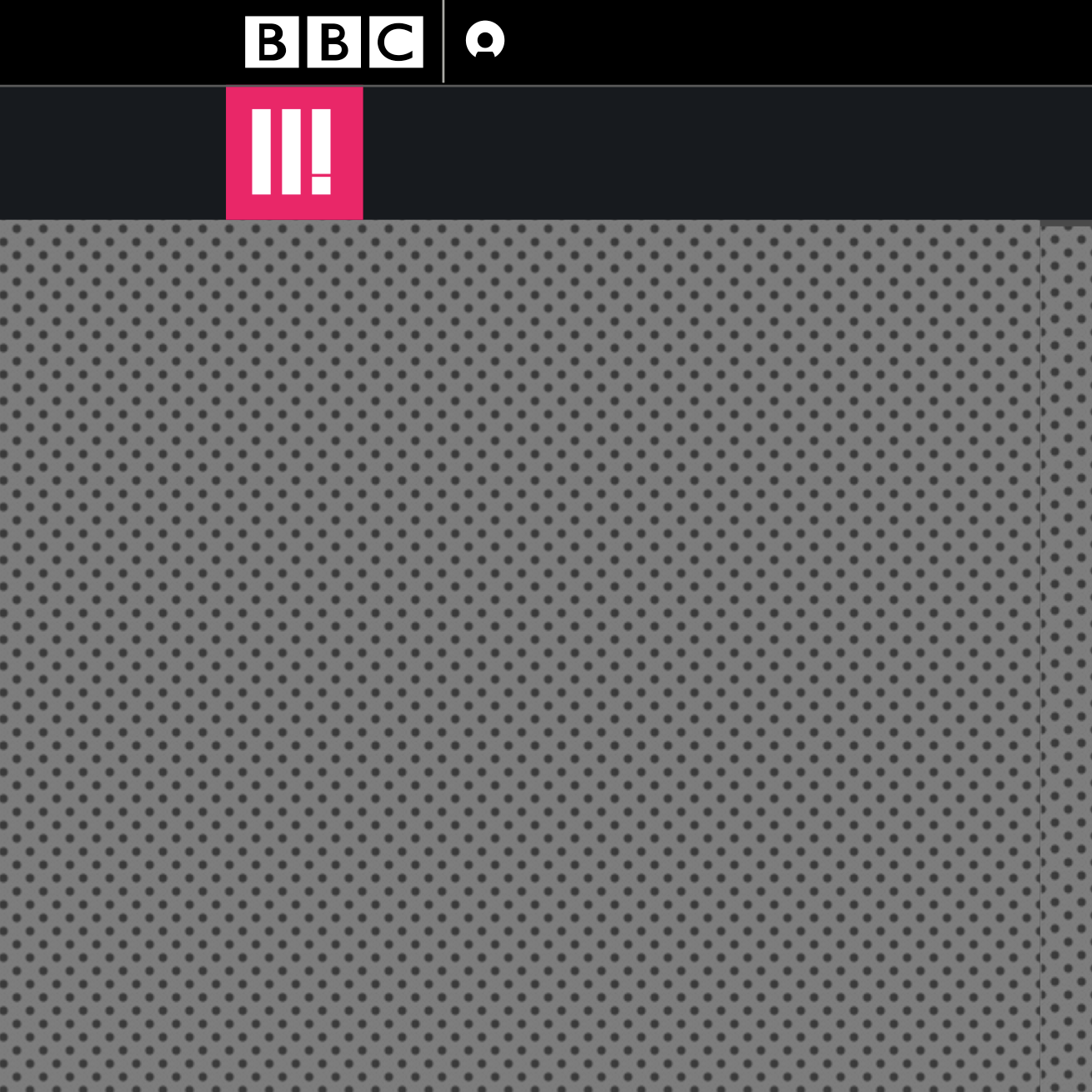
I concentrated on 4 visual brand elements. The logo, looking at allowing the stamp to break out of the square, adding opacity and playing with the logo as an image. Pattern and Texture as a defining element of BBC3 and Colour & Colour Balance to allow the Colour needs to complement the content and not fight with it for attention and overall give more visual breathing space neutrals) that can be used in larger quantities.
02_
Ideating


Typography: Site requirements were to use the new BBC Reith font, and also to follow Gel Guidelines. I felt that a sans serif typeface best suited our product and audience. Various weights & use of uppercase helped create hierarchy and emphasise key text. Reith is a “spacious” font, which alters existing line lengths. We improved hierarchy & contrast by addressing the overall typographic detailing. We also complemented BBC Three’s bold/expressive “typography as image” approach.
03_
Implementing
Key Changes that were made:
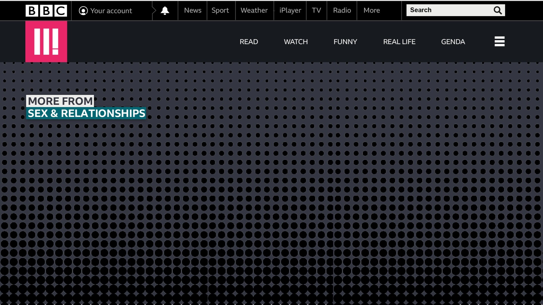
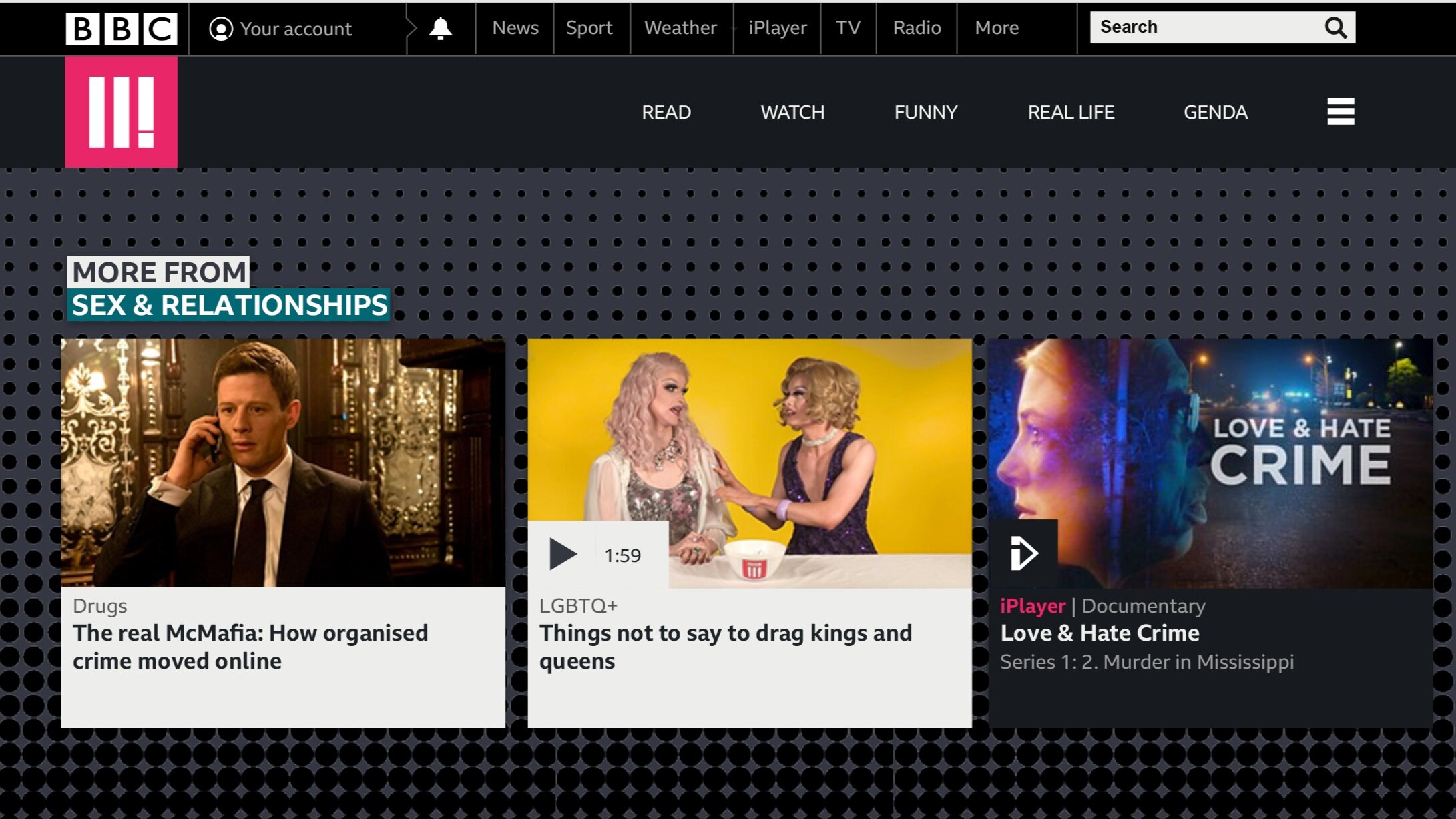
01_A total rethink on the colour balance to create more visual breathing space, soften accent colours use more neutral grey tones.
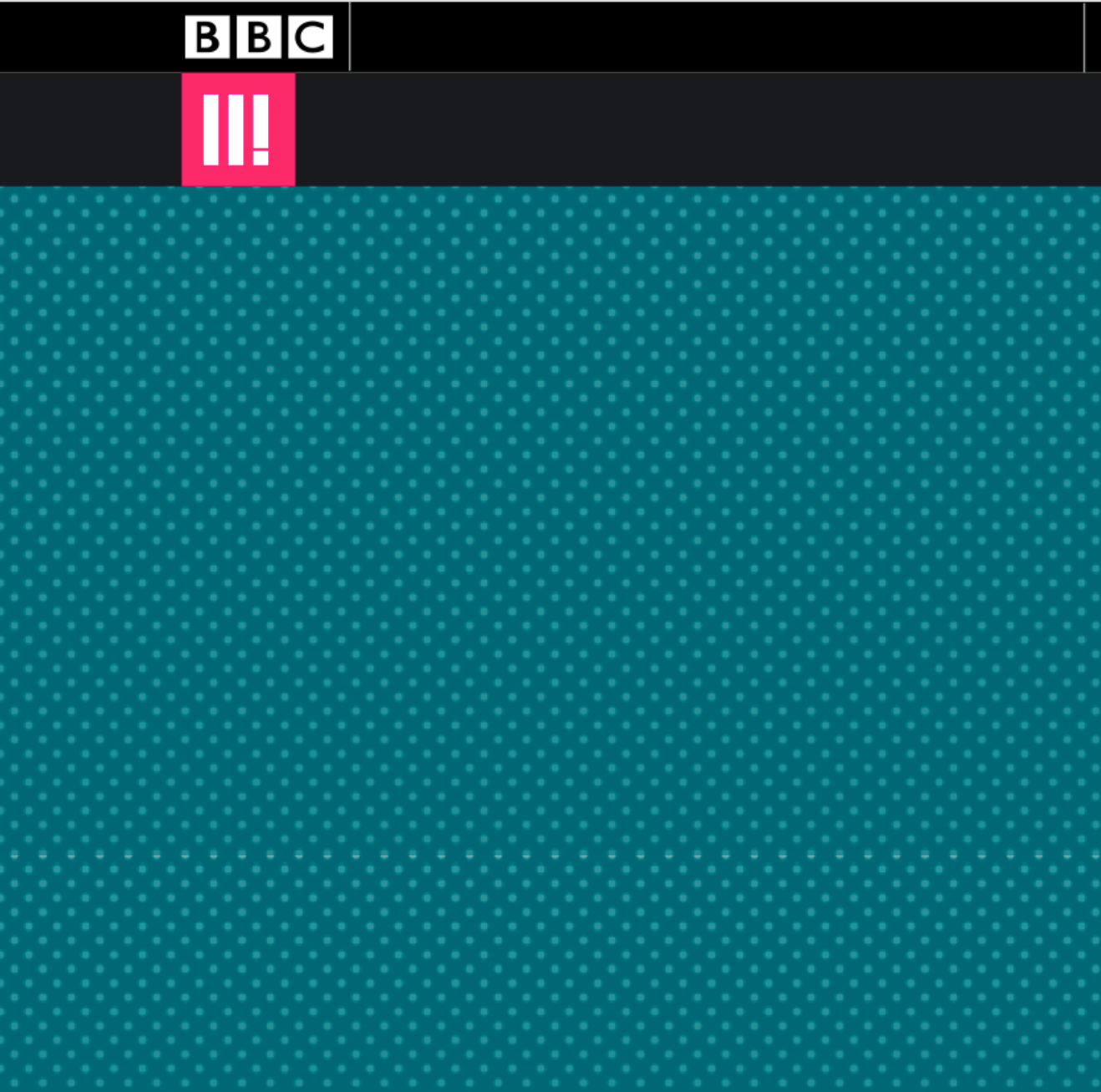
02_Introduce patterns and texture to improve brand recognition and also help connect with the target audience.
03_Use the new BBC Reith font to improve consistency across with BBC.
04_Improve the hierarchy & use of contrasts to help with the overall typographic detailing.
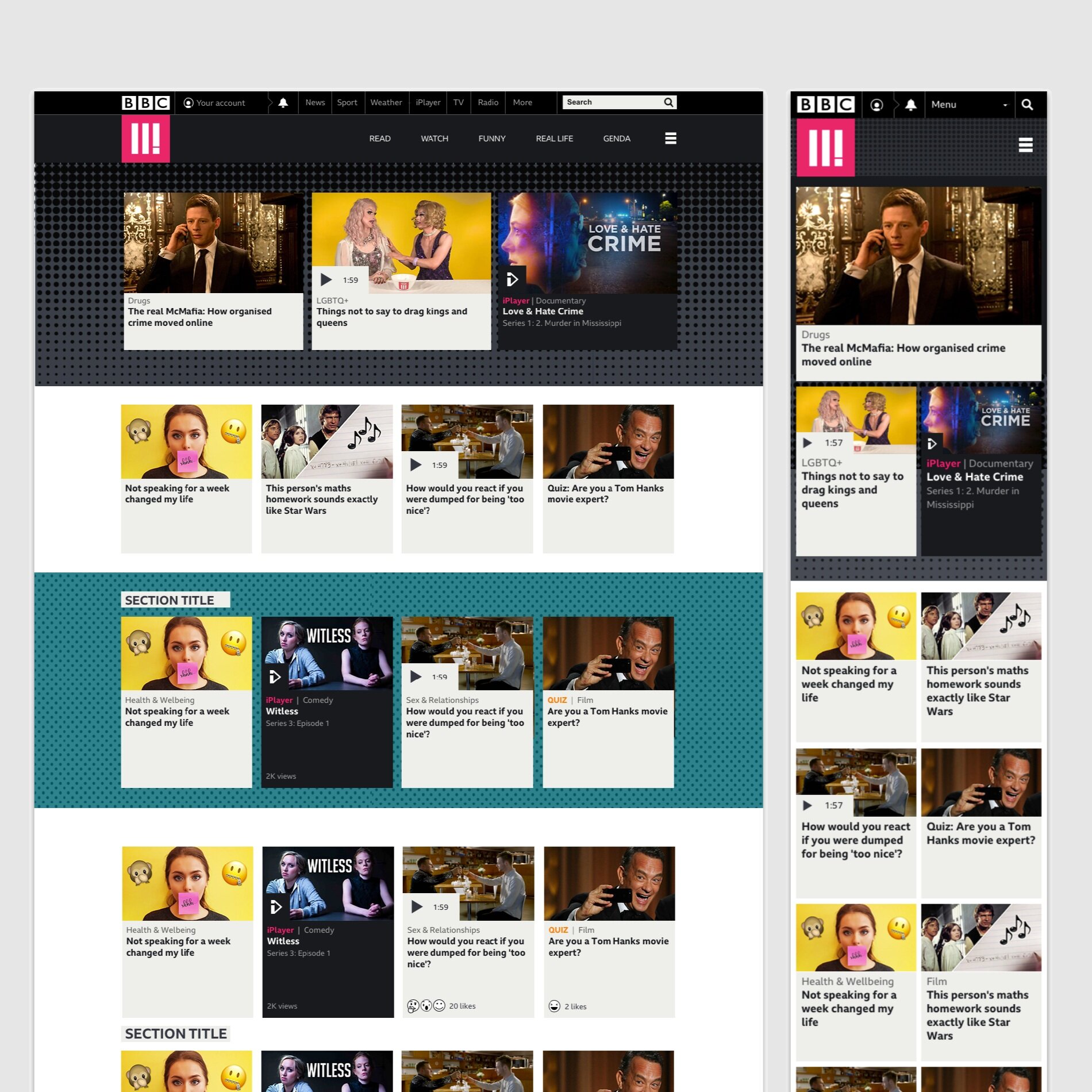
05_Add a new navigation structure on all pages.
06_Develop a 4 column grid (rather than the original 3) allowing for easier skimming.
