
52things is an e-commerce start-up for an interior design consultancy and lifestyle store. I worked with them to create a memorable customer experience.
Role: UXUI lead | Design strategy | Research | Branding & visual language | Copywriting | Prototyping & testing |
THE CHALLENGE:
52things was a new e-commerce storefront for an Interior Design Consultancy and Lifestyle store. In a sea of new entrants in this space, UX design strategy plays an important role in converting these visitors to customers. This startup had a high-level understanding of the kind of experience they wanted to achieve from its mission to: “buy less, but better and only things you love” and I worked closely with them to realise this in a digital context. The focus for this project was to craft a brand and a shopping experience that develops trust and confidence in that brand.
THE OUTCOME:
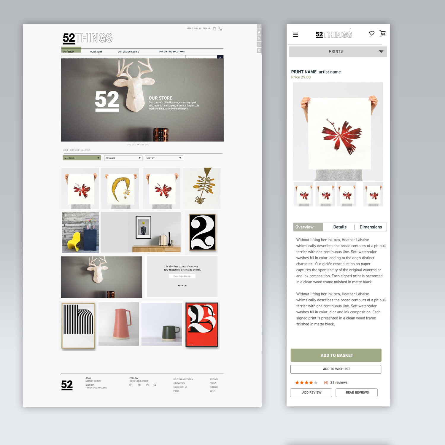
Responsive website design and brand strategy. The focus was on creating a simple but strong visual language and an intuitive shopping experience. I made it a priority to design a solution that focused on preventing cart abandonment during the shopping and checkout process. An easy-to-navigate and aesthetically pleasing interface was also a priority for this brand.
01_
Discovery
& Research
Generative Data - defining the problem & developing a strategy for the business & the user.
1. Client: Carried out contextual inquiries, field studies and interviews. I met with all those involved in the startup, observing their environment to learn from their actions & behaviours. I conducted mind mapping exercises including a 'hopes, fears & expectations' exercise and individual interviews.
2. Users: Interviews & observations of shopping needs, wishes & behaviours.


02_
Defining &
Prioritisation
CLIENT NEEDS
Create a trusted online brand / Develop a clear understanding of the audience to identify opportunities / Have a clearly defined service and present the 52Things as a cohesive unit / Create a online presence that aligns with the core values of 52Things
USER NEEDS
Trust in the brand / Know there is a real organisation behind this site, staffed by honest and trustworthy people / Easy to contact / “Fresh” up to date content / Clean and simple shopping experience / Skilled and knowledgeable, qualified people delivering the service / Informative content / E-commerce sites should be easy to navigate / Eliminate all distractions during the checkout process
PAIN POINTS
Distracting, Uninformative content / Having to commit to signing up before buying anything / Difficulty defining the brand. Are they my tribe? / Complex and long checkout service with too many distractions / Saving all types on content / Friction of selecting a product and making a purchase.
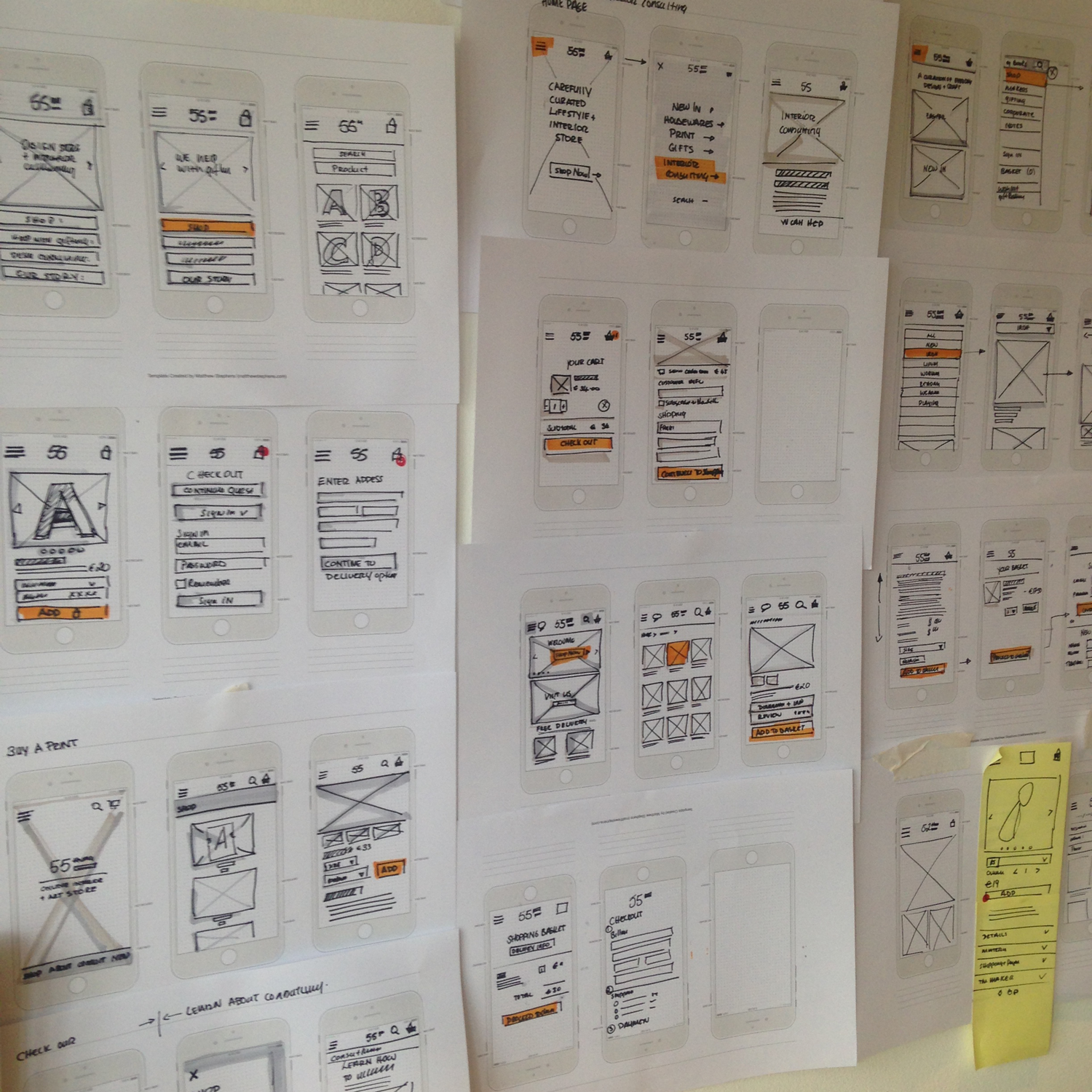
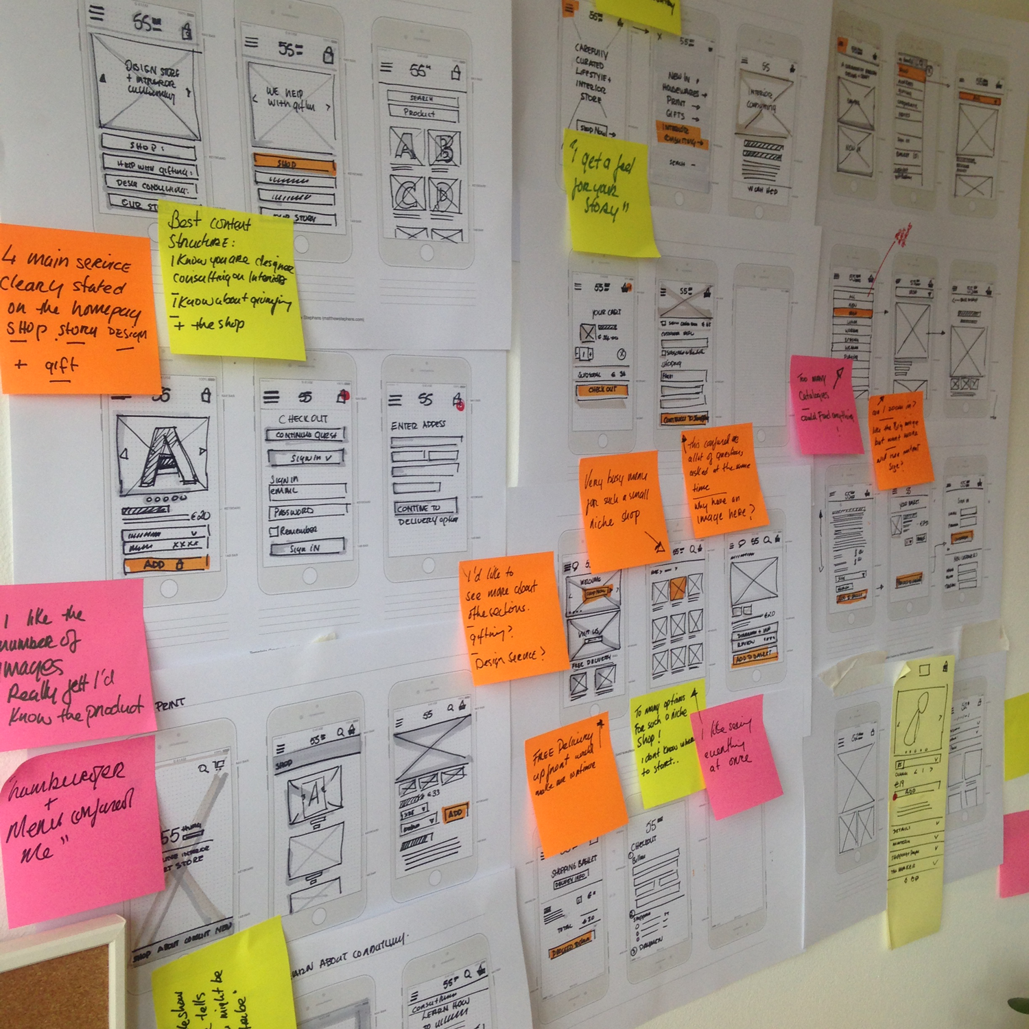
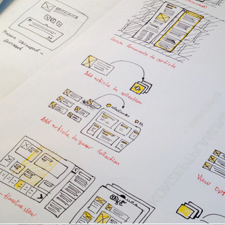


Wireflows (Wireframes & User-flows) Low-fidelity designs were created to allow us to quickly test ideas. Wireflows helped us to define the overall structure of the site, including User-flows for the browsing products, product deep-dive, and shopping cart checkout journey.
03_
Ideation


04_
Implementing
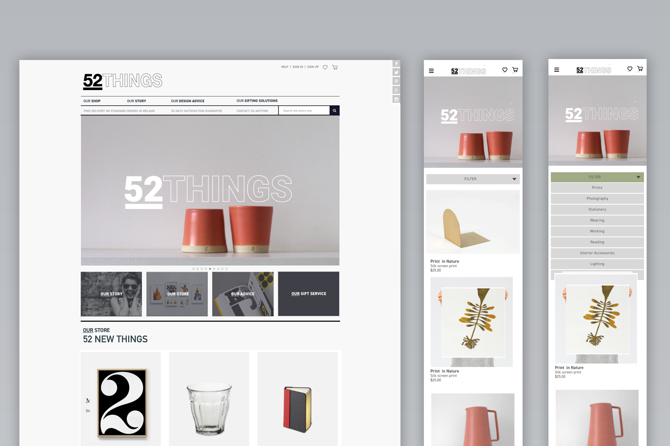
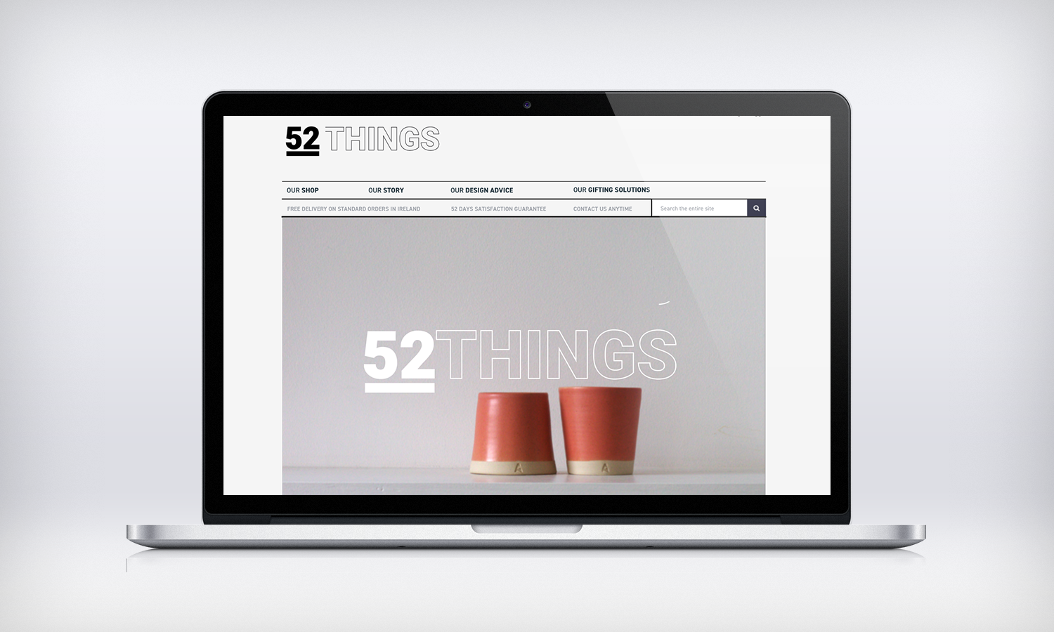
Visual Identity: Since this is a brand that promotes living a minimal lifestyle, it was essential that the brand is simple and clean, yet broad ranging. The logo can be 52things or just 52. The colour palette is clean, using varying shades of black, grey, and white with spot colour of subtle green and dark yellow. The typography choice of Helvetica, is versatile, legible for both headings and body text. The following images are taken from the final design documentation and prototypes which is currently undergoing user testing. The website uses a fully responsive design ensuring an optimal experience on any mobile device.